The Suite
Designing for a unified onboarding flow

Working for our global design team across four offices and 15 time zones, I helped create an onboarding journey as a part of Zendesk’s new bundled product offering. I took over the project half-way through and managed to conceptualise and help launch and alternate onboarding flow for the specific journey I was responsible
Zendesk
Product Designer
January 12, 2017
As the market trends for customer service software moved to omnichannel solutions, Zendesk made the strategic decision to provide a seamless experience across their suite of products. One of the first steps in the endeavour was to start bundling Zendesk's products into a package called The Suite.
Zendesk offers several products, each focusing on specific aspects of customer service. Each product is managed by different parts of the organisation, distributed across the globe.
With the introduction of The Suite, Zendesk needed a new, unified onboarding process the combined four products' flows into one. I took over the project for driving and integrating my product's part of the experience.
The products to be integrated into the onboarding flow were:
Ticketing system for tracking, prioritising and solving customer issues, managed from San Francisco.
Call centre software, managed from Dublin.
Knowledgebase and help centre/self-service solution, managed from Copenhagen and the product I was designing for.
Live chat and messaging service, managed from Singapore.
The strategy team at Zendesk set a project team of PM's, engineers and designers tasked with creating a unified onboarding experience. The design phase of the project was managed by a Senior Product Designer based in Dublin.
By the time I took over the responsibility of creating Guide's onboarding, the project had already been in the workings for 5 months. This meant some decisions and constraints were already set in place. Also, it was already pretty late in the day in terms of the design phase. 5 rounds of user testing sessions were booked and due and we had a short deadline to finalize the design.
By the time I took over the responsibility of creating Guide's onboarding, the project had already been in the workings for 5 months. This meant some decisions and constraints were already set in place. Also, it was already pretty late in the day in terms of the design phase. 5 rounds of user testing sessions were booked and due, and we had a short deadline to finalize the design.
First, as each product was complex in and of itself, it was decided that the unified onboarding flow should act as a teaser for the full product experience. This meant that the onboarding experience should be comprised of simple task-driven flows for each product, helping the user do some basic, initial setup of the said product.
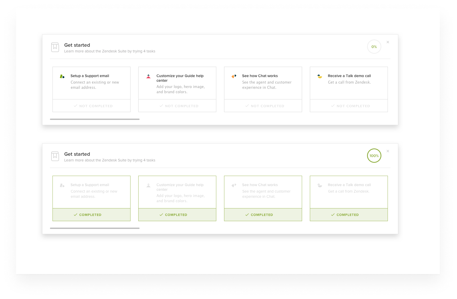
Second, due to technical and time constraints, the onboarding experience would be implemented in a dedicated modal launched from Support. This gave us a narrow frame of 700x482 to communicate the product USP.
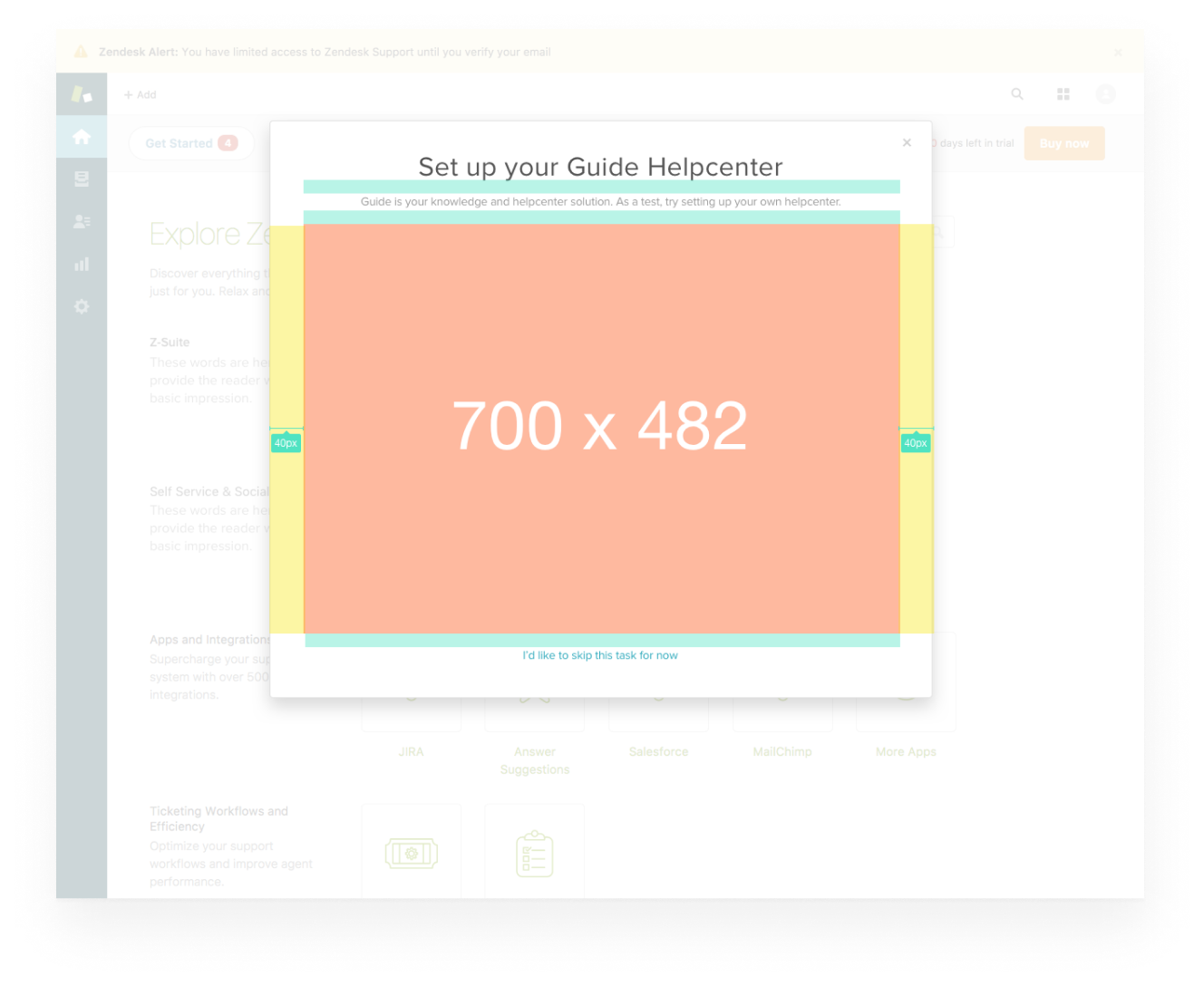
Third, it was already decided from the PM and responsible engineering team the feature we should create a flow around: 'The Knowledge Capture App' (also, 'KC App'), a feature used when handling customer tickets. The reasoning was that it was technically simple to set up.
When I started looking into the KC App as an onboarding piece, I quickly sensed that the decision ideal: The feature required a lot of contextual knowledge to be understood. Worse still, it wasn't even a major selling point for why customers would want to buy the Guide product. I saw it as a too narrow, too complicated feature to showcase. All in all, I didn't think it focused on what jobs customers wanted to get done by purchasing the Guide product.
After some consideration, I respectfully raised my concerns about the decision to go with KC App. While my concerns were heard, we were running on a tight deadline and the team had already agreed on the decision. Therefore, I carried on trying to conceive of best flow given the map laid out.
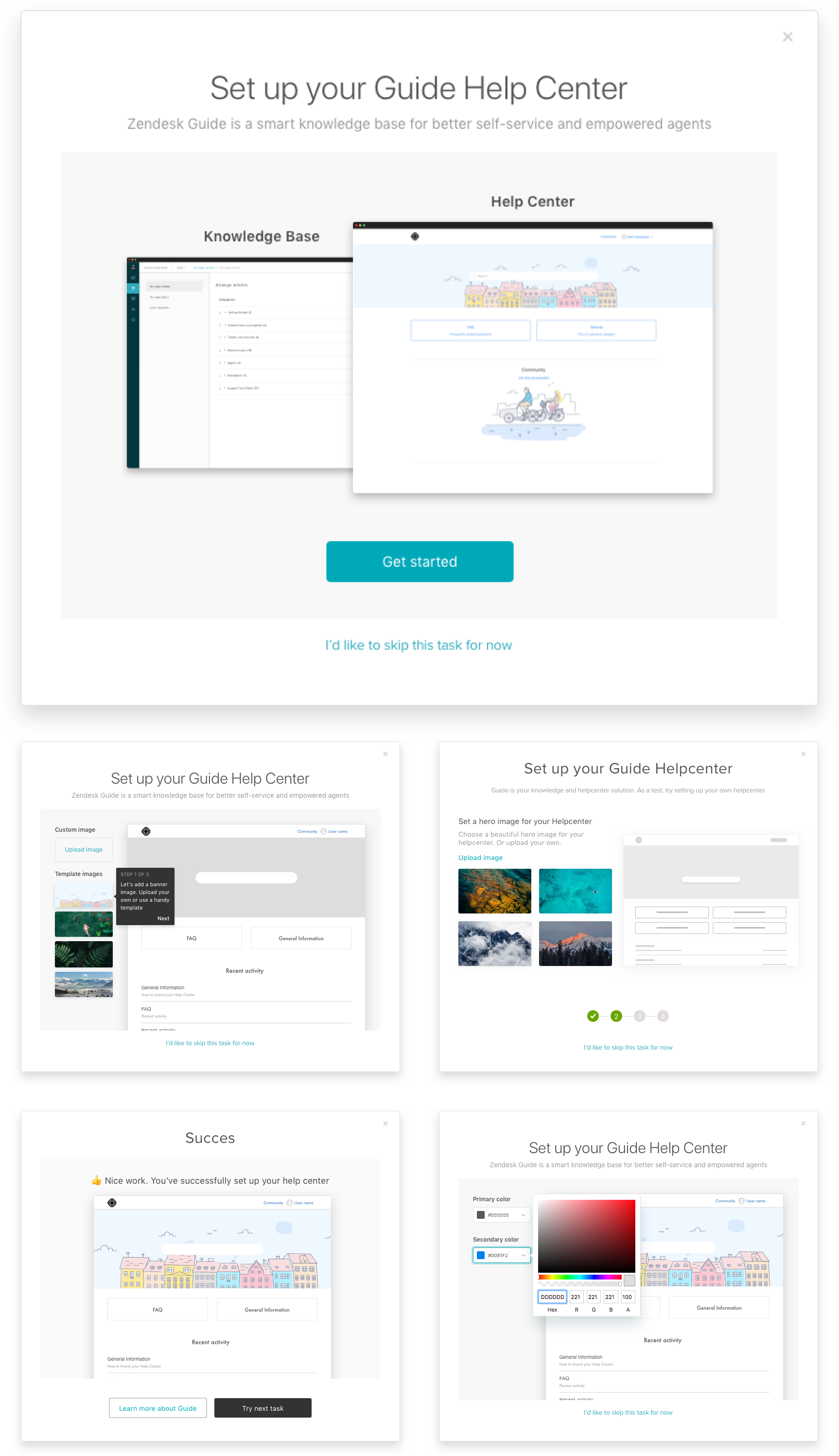
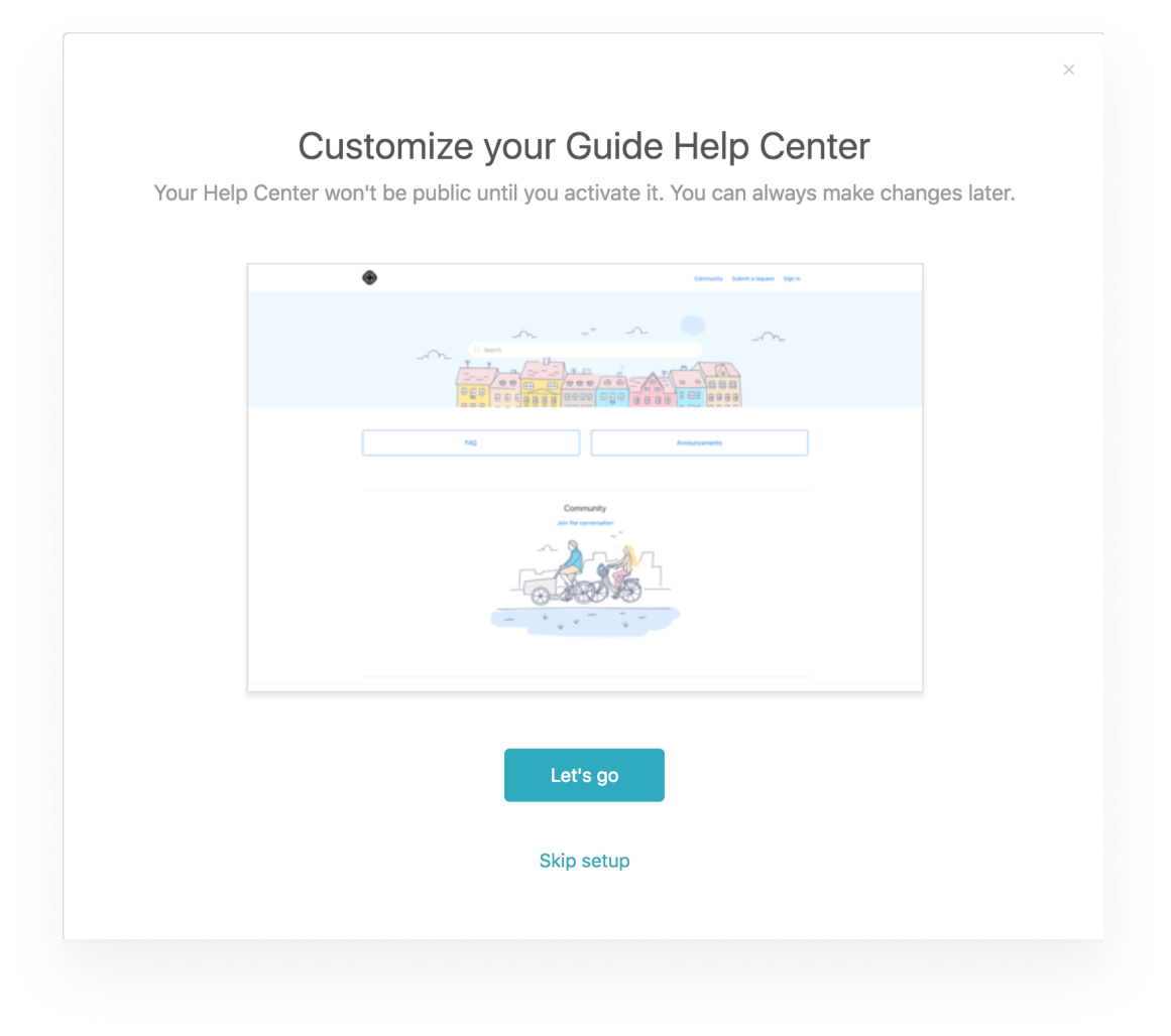
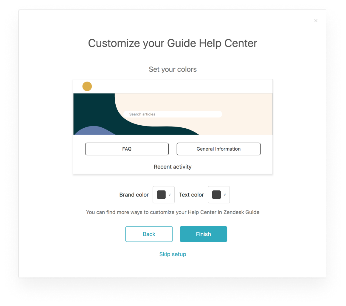
Still, I was convinced that Guide had a much stronger selling point we could focus on instead. A feature much simpler and more engaging - a feature called 'theming center'. Basically, the theming center is an easy-to-use, WYSIWYG editor for a help center. It's the feature our customers used to style and control how their company's customer-facing help center looks.
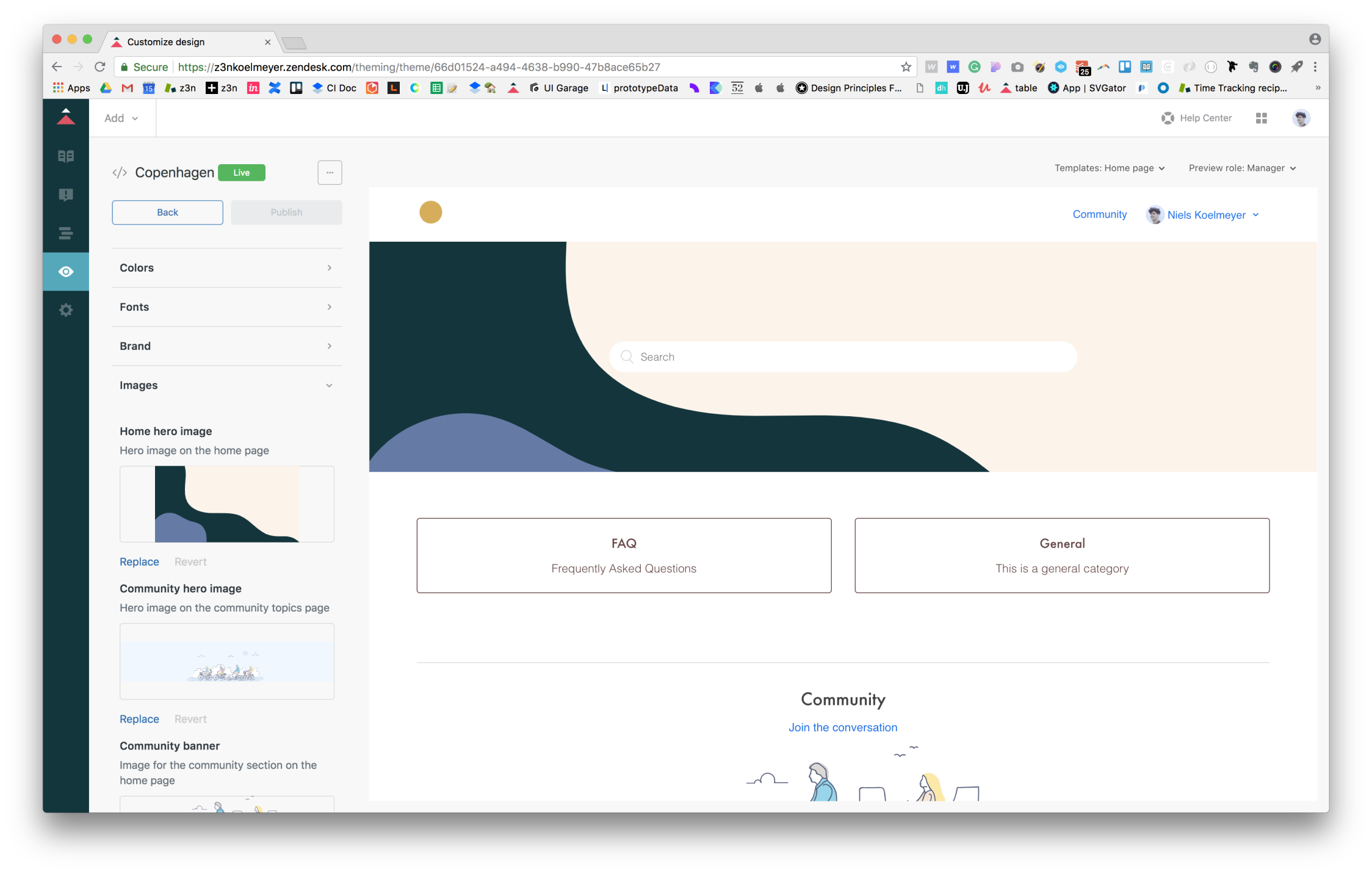
Besides from being self-explanatory, I believed the theming center was the most compelling story to tell: Our data showed that the very first thing new users do is to go and explore it. My thinking went that if we were only able to boil down some of the theming center experience into a simple, visually engaging flow, we'd show huge value from the get-go.
Simultaneously while wrapping up the KC App-flow, I did some quick n' dirty designs on my visions for a theming center-centric onboarding experience. I shared these with my Design Lead explaining my reasoning for wanting to pivot on the flow. He liked the idea so I brought in some of the project engineers to get their estimation on the new flow.
As engineering confirmed the new flow was within the technical scope of the project, I developed a quick prototype in order for me to have an artefact to present to the PM in order to get the permission to pivot the direction of the project.
I presented my work to the PM who agreed that the theming center flow made was a more compelling flow, we should use the Knowledge Capture App flow, at least for the first round of testing. If the test results on the KC App flow turned out negative, he was open consider pivoting to the proposed flow.
The first round of testing was led by our team in Singapore. They tested out an InVision-prototype with 7 users.
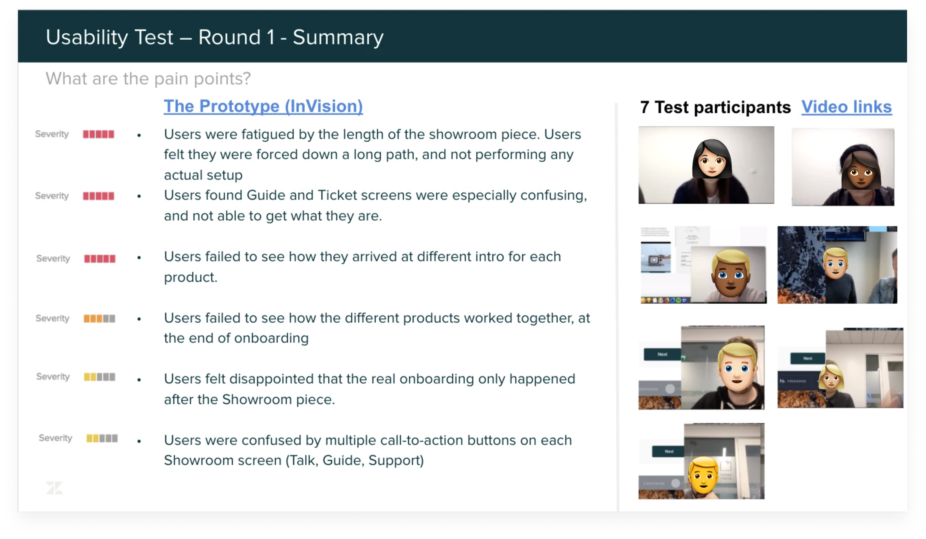
As the reports came in from the sessions, the results were clear: The KC App flow was difficult to understand. This left us with two options: Continue iterating on the KC App flow or pivot our efforts to focus on the theming center flow. We went with the latter.
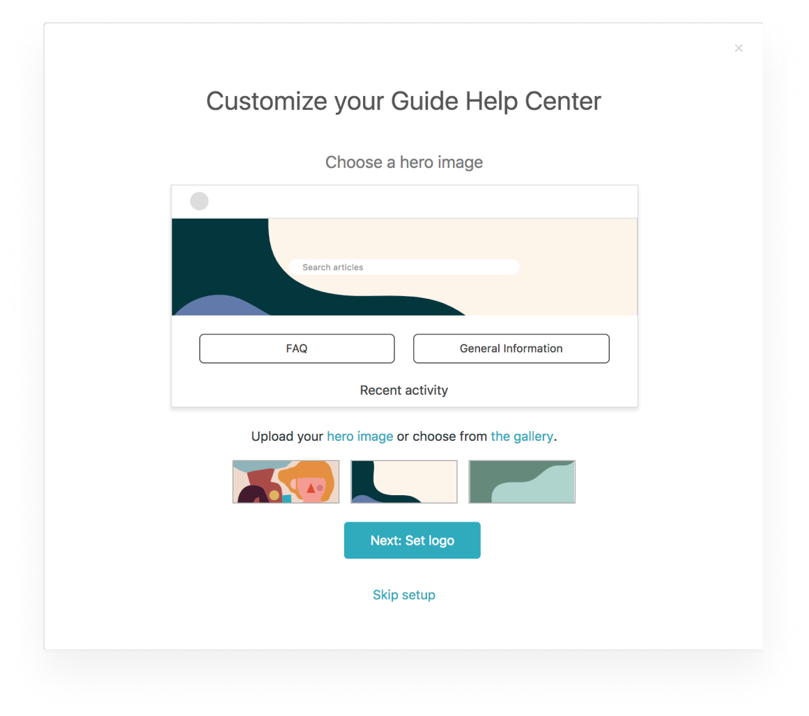
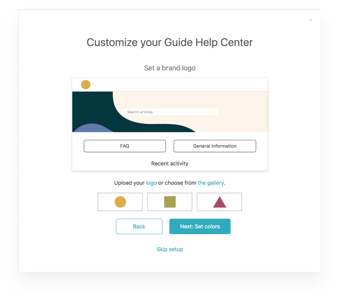
For the theming center flow, my main objective was to boil down the full theming center experience into a lightweight version that would both be functional and fit the constrained dimensions of the UI-frame. But, before diving into the pixels, I started my process by scripting the onboarding flow in a text editor. Using this tool allowed me to think linearly and to churn out a backbone for how my designs should play out.
My storyline was split into six screens:
When I had my storyline down, I started exploring ways to fit all the content into the confined frame. I did some quick sketches but otherwise focused on exploratory designs in Sketch.
When I'd settled on a general direction for the UI, I wanted to explore how we might use interactions to enforce usability and create a more engaging experience. Therefore, I built out the first three task steps of the flow to understand how an interactive onboarding piece might play out.
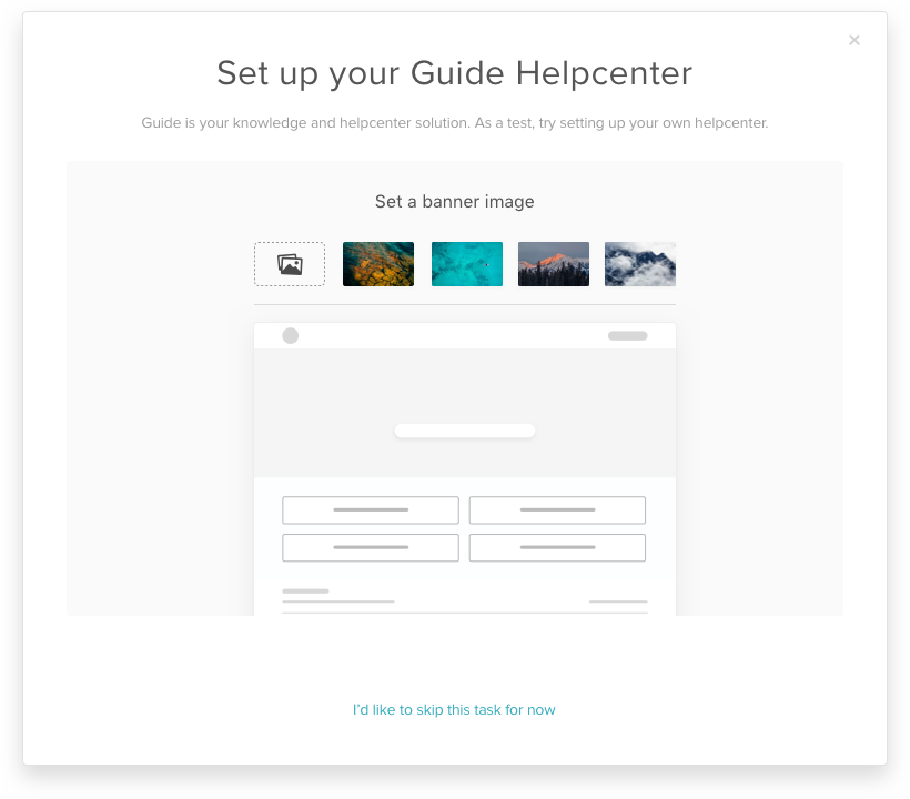
For building the prototype, I hypothesised that onboarding users might not have their brand assets at hand when going through the flow. Therefore, I wanted to provide them with high-quality material so they easily could create a nice-looking help center as a test. I hooked up the Framer-prototype to the Unsplash API so we'd have some beautiful image assets acting as templates and implemented some beautiful colour palettes from Coolors.co.
I believed that the theming center experience was one of the most compelling reasons to buy Guide - data showed that the very first thing most new users do when purchasing Guide is to go and explore it. If we were only able to boil down some of that experience into a simple onboarding flow, we were on the right track.
I pitched the prototype to engineering and to the designers in Singapore who would be running the next round of testing. They liked the idea but suggested we'd rely on purely InVision-based prototypes and didn't use interactions. This way was easier to implement technically and the test team wasn't confident in testing with Framer prototypes.So, I parked Framer for the project in focused entirely on Sketch and InVision as design tools.
I prototyped everything into an InVision-project and ran it by my fellow designers for feedback. We agreed that the flow had too many tasks-to-complete. Still, I wanted to test the full flow to understand which tasks we could keep or discard.
After testing, we found that users were intrigued by the new flow. As expected, we also found became exhausted by the number of tasks to complete. Comparing the test sessions showed that around 4-5 tasks would be the maximum number of tasks to complete while still keeping users interest and engagement. Also, we had some minor UX and copy corrections to make for the following iteration.
Based on these insights, I started iterating on a new, lighter flow.
For the next iteration, I chose to eliminate the step for setting the help centre typography as users initially didn't find any value in this. I quickly prepared the flow for the next round of testing to gauge user feedback.
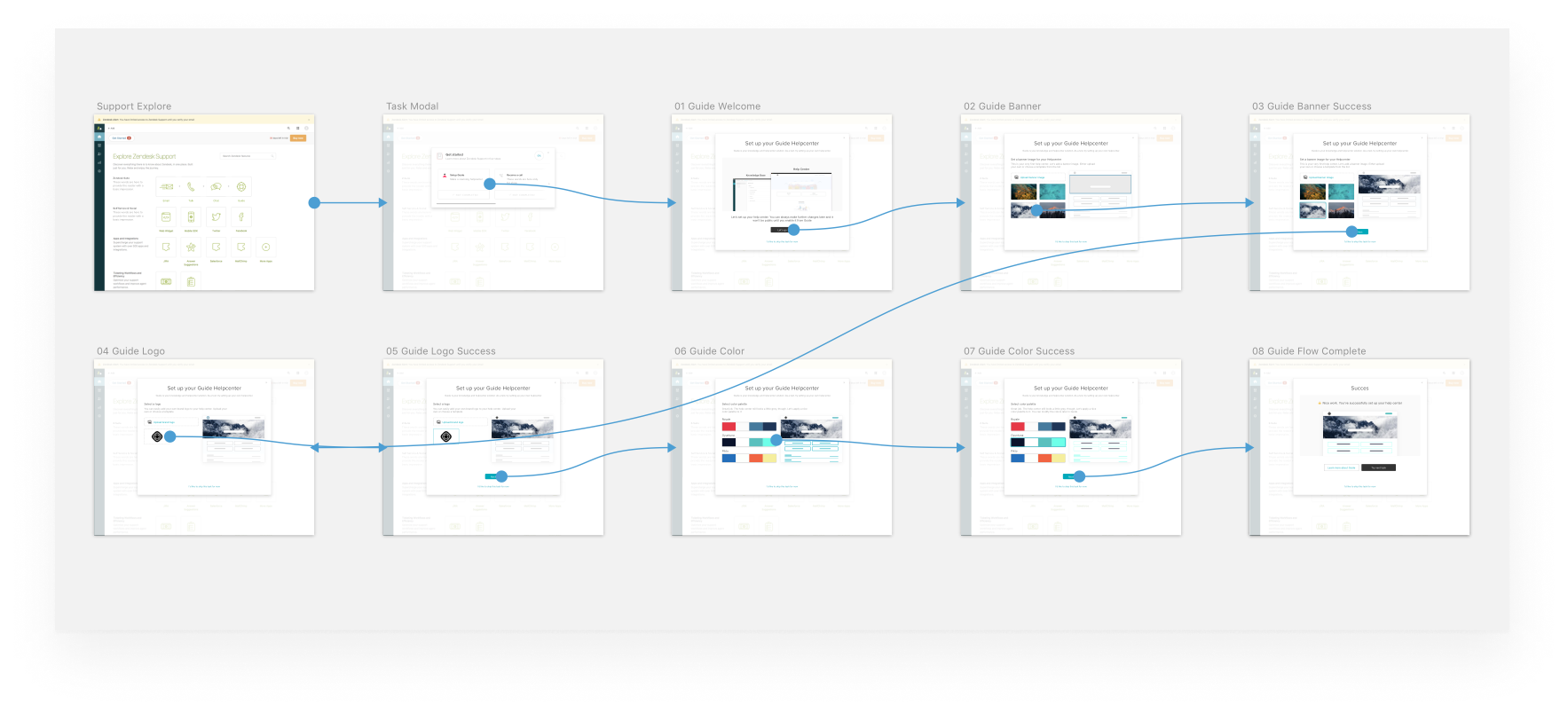
As the simpler flow was tested out, we were getting closer to something meaningful - the users breezed through the flow and understood what they were doing. But we weren't quite there yet.
First off, I wasn't pleased with the current UI. It was simply too messy to look at - everything seemed crammed and jumbled. I wanted to put more emphasis on how the help center would look like and while still leaving the controls noticeable, although less loud.
Secondly, we needed to steer away from providing generic color palettes as part of the flow. Users wanted to use their specific brand colours. As one of the test users proclaimed: 'Why would I want to use these colors? These are not my company's colours'. So I probed our engineering team to allow for custom color pickers to provide users with full control of the palette. Luckily, that was easy to implement both technically and design-wise.
For the duration of the final rounds of user testing, we, the designers, would sync up our designs to a joint InVision-project for testing. After testing, we'd go over the results and concerns about each product-specific task and the flow as a general. We'd also present our designs and findings at weekly syncs with engineers and PM's from the different offices to make sure everyone was aligned. From there, the project went steadily ahead with us iterating and correcting as we learned more from the test sessions.
Unfortunately, I wasn't able to contribute further during the final week of the design-phase as I had to run a Design Sprint on a separate project. Instead, I handed over the project to our Senior Product Designer to do the final polishing, giving it her touch.
The development cycle began as soon as the design-phase came to an end. The engineers started working from our design spec and I transitioned from designing in pixels, to keep an ongoing dialogue with developers and supporting them in building our visions. I'd check in on regular basis, suggesting minor tweaks and we went along. When a test version of the flow was put up, we'd go over the flow, making small corrections as finalise the feature.
The new onboarding flow was released to new customers with the official of The Suite.


